Archives
Students’ projects shimmer and bounce in CFA Atrium
Project to create "interactive walls" designed to shift students’ thinking to unconventional notions of walls
By PATRICIA DONOVAN
Contributing Editor
A selection of "interactive walls" designed by 75 junior-year students in the School of Architecture and Planning will be exhibited in the Atrium of the Center for the Arts through Saturday.
They're a sight to behold—and to be held by.
The students were enrolled in several intensive design studios in the Department of Architecture. For several months, they collaborated in teams of five or six to develop their concepts, structure their designs, select appropriate materials and construct walls that neither look nor feel like your father's cyclone fencing
The purpose of the exercise, said Karen Tashjian, clinical assistant professor of architecture, was to shift students' thinking from conventional notions of "wall" to more original conceptualizations.
"We also wanted to teach them how to work collaboratively to develop that concept from beginning to end—to let go of their need for exclusive ownership of the design," she said, "because in the real world, an architect is a member of a team."
To begin their transformation, the students engaged in a series of stepped exercises. Each student had to relate a found object to the body or to one of its parts and then illustrate their understanding of this relationship in a drawing. Students then analyzed and engaged with the drawings of their team mates, extensively discussing their changing perceptions. The students went on to design walls that reflected their new and shared understanding of how the physical body could relate to the built structure.
"We want them, as architects, to always consider the human dimension in their designs—to think about how the body experiences space and surfaces," said Tashjian. "We want them to engage their visual and haptic senses, in this case to make a "wall"—usually understood to be a rigid object or a barrier—that interacts with human beings in a new and engaging way."
The walls that emerged are not just engaging, however. They're downright startling. You can bounce on some; others glisten or embrace the body the way a wall rarely will. In fact, they're so body-friendly, many visitors will want to take them home.

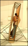
The exhibit features an "inhabitable" two-dimensional wall made of rust-colored latex stretched over a frame, whose interior can accommodate of one or more persons. By simultaneously pushing all of their weight against one surface and then bouncing forward or back to the other surface, the visitors can rock the wall back and forth on its curved wooden rockers.
An extra treat is the variegated color of the latex, which has changed dramatically through exposure to the light, and its surface, which feels like stretched toad skin.
It's a wall, yes, but it's also an odd and intimate funhouse ride.

Another wall is visually abstract, woven of clear, acrylic sticks that are 5 feet long and about 1/8" in diameter. It presents a sparkling, translucent, multi-textured, three-dimensional surface that transmits light but visually mutes the activity behind it. In dark spaces, says Tashjian, it literally glitters.
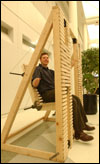
A "lath" wall is constructed of smoothly sanded and finished strips of wood that mimic thinner, rougher cousins nailed to joists, rafters or studding as a groundwork for slates, tiles or plaster. The wall is interrupted by a section hung with counterweights, which, when leaned upon, metamorphoses into a wide, comfortable seat that returns to its "wallness" when the visitor stands up again.

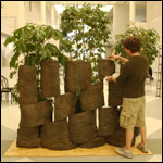
One wall—for all the energy it took to construct it and the heft of its contours—is remarkably Zen-like in its sensibility. The designers selected a rich, brown terra cotta and threw many pounds of it on a huge stone potting wheel to release the air and make it malleable. They formed the wet clay around a cylinder 6 feet high and 4 feet in diameter and allowed it to dry until just damp. The clay then was cut off the form in large, textured, roughly shaped, earth-colored sections of various dimensions. These "tiles" were "strung" on vertical steel bars to form a remarkably sensual, openwork potsherd-like surface notable for its relationship to the earth and the craving it provokes to have it in your house.
There are walls that embrace, a wall lit from within to illuminate human activity behind it, a wall whose visual surface changes as you pass in front of it and a stretchy wall that looks and feels like nylon stretched over thin pipes. It was designed to mimic the trajectory of a skateboarder. Another comfortable, stretchy wall invites passersby to lean into it and relax.
One wall is quite thick, but embedded with many tubular structures that allow visual access to the space beyond. A wall made of curved wooden blocks has armatures that pull out to provide seating. The seats look like the can-opener blade on a Swiss Army knife, but with a cushion or two.
Besides Tashjian, instructors in the Department of Architecture who directed the design studios on this project are Kevin Connors, clinical assistant professor; and adjunct professors Thomas Breen, Laura Garofolo and David Zielinski.
