Here is how we capture our spirit
Photography
Images are a powerful visual asset for helping us tell the rich, full story that is distinctly UB. To aid the selection process, we have created seven curated brand photography collections within the UB Photo Database. Below are examples with descriptions of the collections.
Here.
The setting, wherever that may be. North Campus. South Campus. Downtown Campus. Buffalo. Western New York. In the classroom. In the field. On the field. Abroad.
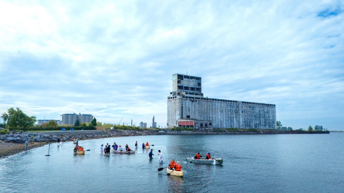
Location-based imagery helps establish our setting for audiences who are new to UB and reinforces it for those who are familiar.
Campus imagery needs to convey an appropriate level of energy and movement, and should be authentic to the campus experience.
Images of UB should frame the university as an integral and central part of the city, and give an appropriate impression of our hometown.
The landscape outside our walls is a unique feature of the UB experience. Capturing our location alongside Lake Erie helps tell a compelling and distinguished story.
Who.
The people. Everyone who makes it happen. Students. Faculty. Staff. Alumni. Community.
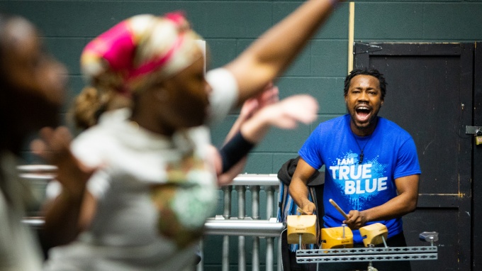
Images of people should feel candid, natural and in the moment. Representing people in their natural, everyday environments is important.
Depictions of students in a classroom or working environment should feel intimate and authentic. Natural light should be used whenever possible. Single students should never seem lonely, and groups should always seem collaborative. Capturing a sense of curiosity, interest or discovery is a great way to accomplish this.
Outside the classroom, it’s important to show people engaged with their environment or involved in an activity, whether that’s on campus, in the city, in nature or abroad.
UB is a diverse place, comprising people of all faiths, ethnicities, orientations and abilities, and that diversity is one of our biggest pride points. Be mindful of capturing the breadth of who we are when you document our community.
How.
The Buffalo way. Hands on. Collaborative. Intense. Engaged. Smart. Enthusiastic.

How we do things here at UB is as important as what we do. Capturing our process is integral to building an authentic image library and attracting new and talented students, faculty and staff.
Ideally, “how” images are a combination of who and what, meaning that a person and an object are always present.
The framing can be tighter and more detailed than usual. Action should be implied if not obvious, and any additional context like the environment or other objects for conveying scale are helpful. As always, lighting should be natural.
What.
The subjects. What we’re innovating. What we’re studying. What we’re improving. Everything we use to move the world forward.

Object-based imagery can play a large role in our communications, serving as a window into our areas of study and the tools of our trades.
Interesting and unexpected perspectives will make for more dynamic communications. Framing can vary from tight to wide and everything in between—whatever helps to showcase the object best.
Often what's on the researcher's computer screen makes the most interesting visuals. Researchers' PowerPoint presentations can be a rich resource for imagery.
Cultural Hallmarks.
Things from the past and present that make UB unique. Our quirks. Our traditions. Our most treasured characteristics.

The Cultural Hallmarks category highlights our traditions and iconic spaces.
Our iconic bronze bison, Baird Point, Hayes Hall and special spots on our campuses are ideal for use in our communications. Images like these are very important in distinguishing UB from other universities.
Our iconic events include commencement, Oozefest, Human UB and homecoming, to name a few. These types of True Blue traditions should be celebrated visually in our communications.
While we have a modest collection of historical photos in the UB database, we recommend the careful consideration of their usage. A larger collection is housed on the university archives website, but permissions and photo credit are required from university archives in most instances.
UB’s history and heritage can be a useful component to communications, but the inherent lack of diversity in archival imagery should be considered.
Environmental Portraits.
The profiles. The difference-makers. The people who make us who we are.
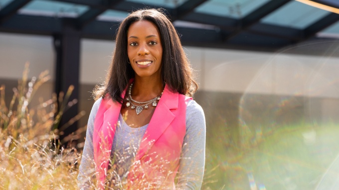
Portraiture is an effective approach in communicating stories and recounting personal journeys. When these images are shot in a creative and compelling way, they showcase the subject's passion and energy.
The setting for a portrait should be appropriate to the subject’s program or area of interest. Contextual elements such as the tools or settings that relate to the topic are helpful in building an interesting and authentic image.
Clothing should be appropriate for the setting and purpose of the communication. Subjects should feel comfortable. Patterned clothing and non-UB logos should be avoided.
Patterns and Details.
An extension and abstraction of the What and Where categories. Images that showcase the beauty in the details.

Details of architecture, nature or three-dimensional objects can provide great visual content and be used as a background or complement to other visual elements or typography. These types of shots are good to use for establishing a mood or when copy doesn't reference anything specific.


