Supporting Graphics
University units may want to create their own supporting graphics, such as icons, geometric designs, patterns, text and/or shapes, to distinguish themselves and better communicate their messages. Here are guidelines for the creation of new supporting graphics and their acceptable use.
Creating new supporting graphics
In addition to the university-sanctioned official unit lockups and existing graphic elements, UB entities may use other supporting graphics to establish a more unique look within the university brand standards. Supporting graphics may include pairings of colors from the brand palette (as long as they do not dominate blue and white as the primary brand colors), icons, geometric designs, patterns or shapes. Such graphics can be effectively applied across myriad unit communications, from print to digital, and, when correctly paired with brand typefaces and other visual elements, can help to enhance the distinctiveness of a unit and communicate its functions.
Units may create their own supporting graphics but should utilize a professional designer to ensure that the brand’s creative expression is followed. New graphic elements should be shared with University Communications for review before broad application to ensure compliance with these standards.
Unsanctioned supporting graphics
Graphic elements become problematic when they are combined with typography and text, especially a unit’s name or acronym. When graphic elements begin to incorporate type, internal and external entities may confuse that mark for the unit’s official visual identity. This misinterpretation, coupled with repeated application in similar fashion, can lead to greater prominence, usage and recognition of the graphic element rather than the official brand extension or sub-brand lockup. The repeated use of supporting graphics as a new logo mark instead of the unit’s lockup is strictly prohibited.
Official lockup vs. supporting graphic vs. unsanctioned logo
Correct:

Example lockup
Correct:

Supporting graphic
Incorrect:

Graphic element with type
Supporting graphics in context
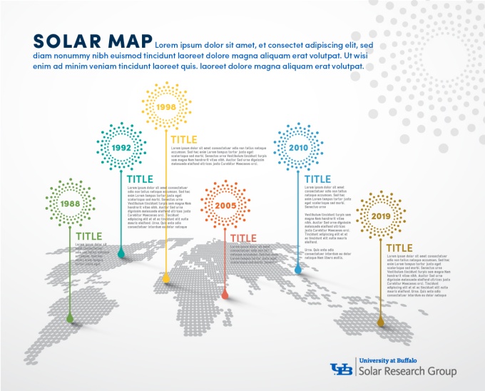
Brand colors, typography and graphic elements can be used in a way that ties informational design needs to the university’s visual identity, as illustrated by this example infographic:
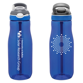
In this example, note how the radial design and the title “UB Solar” in bold type are kept separate from one another. These graphic elements are part of the overall design of the infographic and don’t break any identity/brand rules, as this is a single-page communication with the unit’s lockup placed on the bottom of the page. The orientation of these elements should not be extracted from the explanatory infographic to appear as a primary mark in other communications collateral. Instead, these supporting graphics, in conjunction with the unit’s sanctioned lockup, can be effectively utilized elsewhere, such as promotional merchandise:
Best practices for supporting graphics

In this example, the radial design is used as a supporting graphic while the official lockup represents the unit.
It is imperative to understand that our brand exists to bring structure and consistency to the image that the university projects. Standards for supporting graphics exist to ensure that we as an institution communicate with a coordinated voice and visual expression. You can create communications that align with the university’s overall mission by adhering to the brand standards and being mindful of the following considerations:
- Embrace your sanctioned brand extension or sub-brand lockup as your primary mark.
- Express your unit’s distinctiveness through creative use of:
- Photography
- Color
- Brand typography
- Layout
- Compelling copy and storytelling
- Thoughtful design elements
- Keep graphic elements and typography (and full text) visually separate (i.e., not locked up).
- Where graphic elements and type are used in close proximity or as part of a composition, ensure that doing so is for explanatory or illustrative purposes only and isolated to that singular application. Supporting graphics and type should never be joined and reapplied in other uses.
- When using supporting graphic elements in proximity to university marks or lockups, please adhere to the proper amount of clear space.


