Lines and Bullets
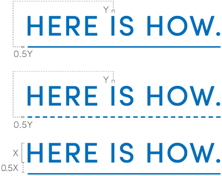
Lines are a great way to establish hierarchy, to guide navigation within a layout, to emphasize a word or phrase, or to set page borders and organize content. Lines can also convey process and place, helping reinforce the concept of “Here is how.”
Solid

Dashed

On this page:
Working with lines
Lines are a very elementary graphic treatment, but applying them thoughtfully can elevate a single design or family of communications. An easy way to be thoughtful about the use of lines is to establish a common weight throughout an entire piece of collateral. Another is to make sure the weights consistently relate to another design element in a layout, for example, the weight of text.

For standard print pieces (around 8.5 by 11 inches), rule weight should most commonly be set to 2 or 3 points and should not exceed 5 points. This rule of thumb can be scaled up proportionally for larger pieces.
Lines in applications
Most applications in Adobe Creative Suite have a contextual menu for Strokes that should be used to customize lines. The menu to the right shows the basic controls, such as Weight, Cap, Join, Alignment and Type.
Weight is variable, depending on the size and scale of the piece. The Cap should always be set to Butt Cap, and the Join should always be set to Miter Join. Alignment can vary based on the situation, but the only stroke types allowed are Solid and Dashed (3 and 2) — both highlighted on the menu.
When using linework near a master brand mark or unit lockup, please adhere to the appropriate amount of clear space. Learn more about clear space rules here.
Ends
Ends are a great and simple way to add visual interest to a layout. But they can also be used to convey a variety of ideas: Start here, end there; this goes with that; do this, then that; and so forth.
Used in conjunction with lines, ends can help convey direction or movement, establish an origin point or an end point, or call out specific information within a layout.
To the right are a handful of the most common end pairings, with both Solid and Dashed line treatments. Alternatively, any of these ends can be used singularly, without a matched or contrasted pairing.
Ends in applications
Most applications in Adobe Creative Suite have a contextual menu for Strokes that should be used to customize ends. The menu to the right shows all of the Start/End options available, with the ones permitted for use within the UB brand highlighted.
Bullets
Bullets are useful when labeling information, establishing a step-by-step process, comparing and contrasting similar items, or creating a connection between disparate elements.
Solid Letters

Solid Numbers

Open Letters

Open Numbers

Working with bullets
Bullets—used on their own, or in conjunction with Lines and Ends—are a versatile contextual element that can be used in a variety of ways.
Graphic Bullets can replace the standard bullet characters in the Sofia and More typefaces (though this isn’t a requirement). They can also replace Circular Ends on Solid or Dashed Lines.
Bullets can contain letters, numbers or the other typographic characters shown here. When displaying other typographic characters, Bullets can function more as miniature icons.


