Usage
Using type thoughtfully is crucial to making our designs look professional. Follow these tips to make sure our typography is consistent and effective.
Leading
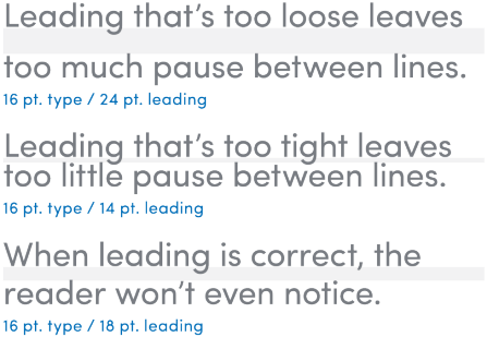
Line spacing, called leading, is critical to setting professional-looking type that’s easy to read. Leading should be set tight, but not too tight. All our typefaces generally look best with leading set slightly looser than the default.
A good rule of thumb is to start with leading that’s two points higher than the point size of the text. This won’t always be right, but leading can be adjusted most easily from there.

Tracking
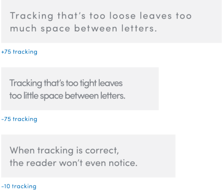
Correct letterspacing, called tracking, also helps to make the type easy to read. Outside of headlines, our typefaces should always be tracked slightly tighter than the default setting, and optical kerning should be used when available.
The word “tracking” refers to overall letterspacing for groups of letters and entire blocks of text. The word “kerning” refers to selective letterspacing between pairs of characters.


