Do’s and Don’ts
Review these helpful examples for using the student group logo properly.
If you have any questions about branded merchandise, including designing, finding a vendor or following guidelines, please reach out to Chloe Milbrand at cmilbran@buffalo.edu.
1. The pentagonal construction, or emblem, featuring the UBuffalo name and spirit mark must remain unmodified in all orientations and applications. Only the group name is editable.
Correct:

DO edit the group name portion of the template.
Incorrect:
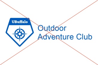
DON’T alter the emblem portion of the mark.
2. In merchandise applications only, the emblem can be separated from the group’s name on a single application, but it cannot be used by itself. The group’s name must always be visible to provide appropriate affiliation (e.g., a long-sleeved T-shirt that features the pentagon on the front and the group’s name on the sleeve).
Correct:
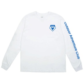
DO use the emblem in conjunction with a group name.
Incorrect:
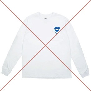
DON’T use the emblem by itself.
3. Arial Regular is the only typeface that can be used for the group name.
Correct:

DO use Arial Regular.
Incorrect:
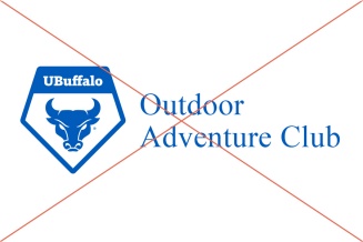
DON’T use a different font.
4. If you decide to use this logo construction, it must replace what you have currently as your group’s mark. Using this emblem demonstrates your direct affiliation with UB and connection to the campus community.
Correct:
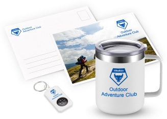
DO use the logo construction only.
Incorrect:
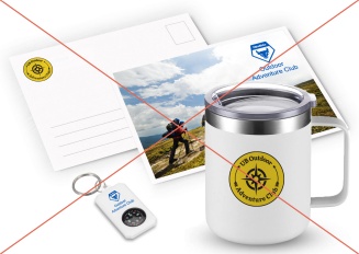
DON’T use two different logos.
5. You may use other UB trademarks together with the student group logo on collateral or merchandise, but the application must comply with the emblem’s clear space rules and other brand guidelines.
Correct:
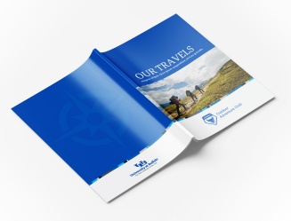
DO use extended clear space between the student group logo and other university trademarks.
Incorrect:
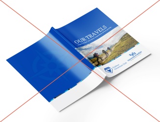
DON’T place a student group logo near other university trademarks without adhering to extended clear space rules.
6. Only the configurations you see here are permitted. The group’s name can never appear above or to the left of the emblem. Please follow the alignment, font and sizing guidance for each configuration below.
Correct:

DO use the correct horizontal configuration.
Incorrect:

DON’T move the group name to the left of the emblem.
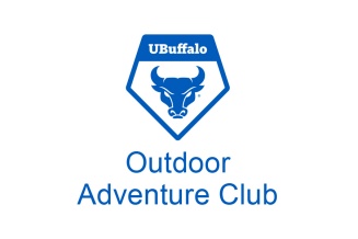
DO use the correct stacked configuration.
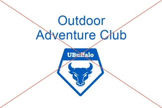
DON’T move the group name above the emblem.
7. The mark should always appear in UB Blue and Hayes Hall White. White versions are available by request for merchandise and environmental applications only. Merchandise orders must be requested through Trademarks and Licensing.
Correct:

DO use UB Blue.
Incorrect:
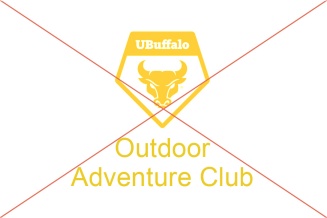
DON’T change the color.
8. The text color of the club name can either be in UB Blue or Hayes Hall White. Consider what color combination works best when selecting merchandise. The text color should be selected for maximum color contrast. Do not use white text on a light-colored background. Do not use blue text on a dark-colored background.
Correct:
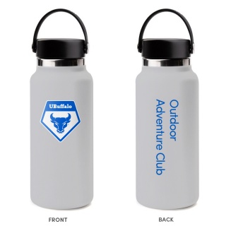
DO use blue text on a light-colored background.
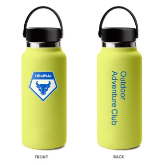
DO use blue text on a light-colored background.
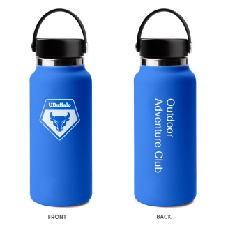
DO use white text on a dark-colored background.
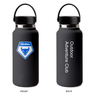
DO use white text on a dark-colored background.
Incorrect:
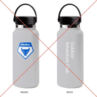
DON’T use white text on a light-colored background.
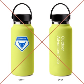
DON’T use white text on a light-colored background.
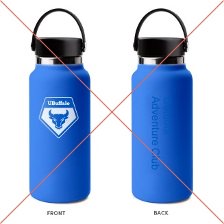
DON’T use blue text on a dark-colored background.
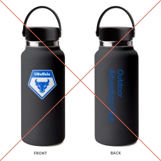
DON’T use blue text on a dark-colored background.
9. Usage of this mark, as with any other UB trademark, is subject to royalties and trademark and licensing regulations.